
Quick Answer
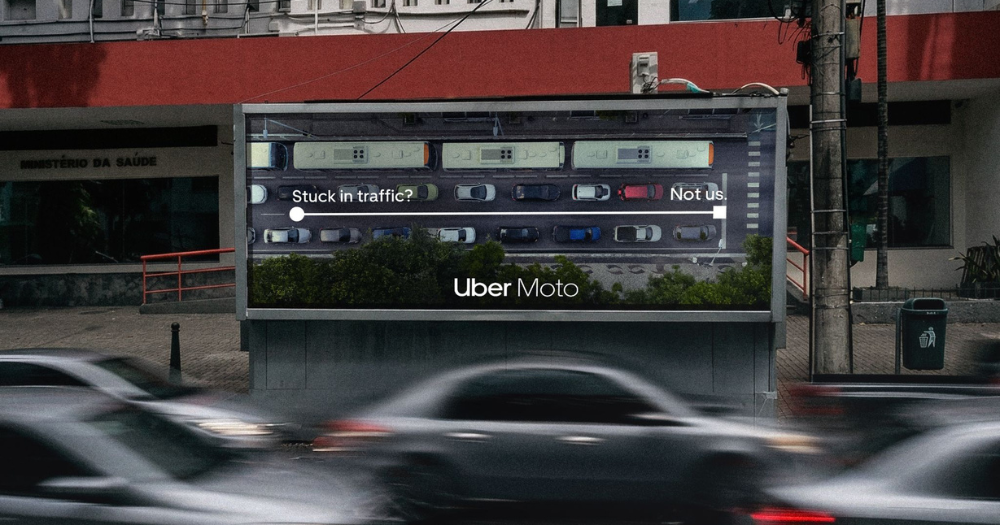
Uber’s OOH campaign in Brazil shows how Uber Moto helps users move faster through heavy traffic. By using aerial views and the app’s route line, the campaign turns congestion into a clear visual advantage.
Traffic Becomes the Creative Hook
Uber’s OOH campaign is built around a very familiar urban reality: heavy traffic. Instead of treating congestion as background context, the brand makes it the central visual and strategic element of the campaign.
By doing this, Uber turns a daily frustration into a direct argument for using Uber Moto. The problem is not hidden or softened. It is displayed openly, which makes the message more relatable and immediate for audiences who deal with traffic every day.
Aerial Visuals Make the Benefit Instantly Clear
The campaign uses aerial views of congested streets in Brazil to show the scale of the problem. These images are visually powerful because they capture the density, disorder, and stillness of traffic from above.
At the center of these scenes, Uber places the recognizable route line from its app. This graphic element becomes the symbol of movement, creating a sharp contrast between vehicles stuck in place and the idea of forward motion.

Uber Moto Is Presented as a Practical Solution
One of the campaign’s strongest qualities is that it does not rely on an abstract promise. Uber Moto is shown as a real mobility alternative in a context where time lost in traffic is a daily issue.
That makes the communication much more effective. The campaign is not simply saying that Uber Moto is fast. It is showing why that speed matters and how it responds to a specific urban need.
The Simplicity Works Perfectly in OOH
This is a strong example of outdoor advertising that understands the medium. The message can be understood in seconds, which is essential in billboard communication.
There is no visual overload and no unnecessary explanation. The contrast between chaos and movement does the work immediately. That clarity gives the campaign strong stopping power and helps make the idea memorable.
A Campaign That Connects Product, Context, and Brand
Uber’s campaign succeeds because it aligns all the right elements. The product benefit is clear, the urban context is relevant, and the visual language is directly connected to the brand through the app’s route line.
As a result, the campaign turns a common city problem into a meaningful brand advantage. It shows how a simple insight, expressed with the right visual strategy, can become an effective and memorable OOH execution.
Summary
Uber’s latest campaign focuses on one of the biggest urban pain points: traffic. Instead of showing motorcycles directly, the creative developed by Wieden + Kennedy uses aerial shots of congested streets in Brazil and places the app’s iconic route line at the center of the visuals.
The idea is simple but powerful. While everything else appears stuck, the route line represents movement and efficiency, reinforcing the value of Uber Moto. The campaign is grounded in real context, as drivers in Brazilian cities lose dozens of hours each year due to congestion.
Sources
- https://www.latinspots.com/noticia/uber-moto-y-wk-presentan-la-ciudad-a-tu-ritmo-con-rivvaa/92273
- https://www.lbbonline.com/news/singer-ludmilla-escapes-the-chaos-with-uber-brazils-new-bikes
- https://www.linkedin.com/posts/mercado-negro-advertising-news_campa%C3%B1a-ooh-de-uber-destaca-el-beneficio-activity-7446693171050319872-dUvP
- https://www.youtube.com/watch?v=pLFa9a4GZ9o
FAQs
What is the main idea of the campaign?
To show that Uber Moto can help users move faster through heavy traffic.
What visual element stands out?
The app’s route line placed over aerial images of congested streets.
Why is this effective in OOH?
Because the message is simple and can be understood instantly.
Where did the campaign take place?
In Brazil, where traffic congestion is a major issue.
What makes this campaign different?
It focuses on the problem and visual solution instead of showing the product directly.
Craft emotive OOH that resonates
Explore high-visibility print and OOH formats that elevate brand values and recall.


Comments
Be the first to comment.