
Quick Answer
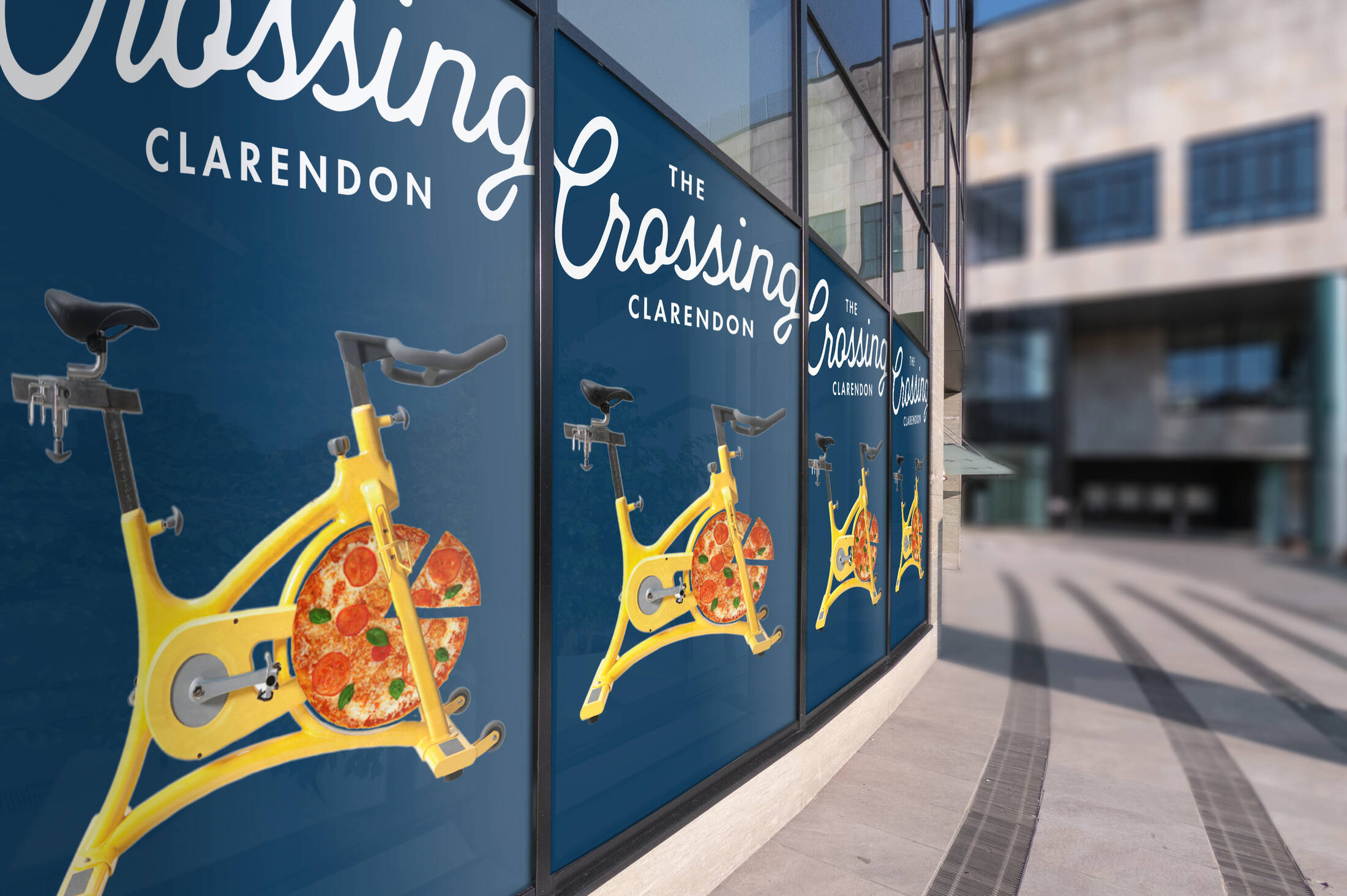
The Crossing is the rebranded identity of Clarendon Commons in Arlington, Virginia. The campaign repositioned the shopping center as a stylish, relevant, and vibrant destination capable of competing with newer live-work-play developments.
A Shopping Destination with Strong Roots
For years, Clarendon Commons was a recognizable retail hub in Arlington, Virginia. With tenants such as Whole Foods, Apple Store, Barnes & Noble, and other upscale boutiques, it built a reputation as a dependable and stylish destination for local shoppers. Its identity was tied to quality, familiarity, and a premium everyday experience.
The Challenge of Staying Relevant
As consumer expectations evolved, newer “live, work, play” developments began to redefine what people wanted from retail environments. Shopping centers were no longer judged only by the stores they offered, but by the overall experience they created. Clarendon Commons needed a new way to compete in a landscape shaped by entertainment, lifestyle, and cultural relevance.

A New Name with New Energy
The rebrand to The Crossing became the foundation for a renewed identity. Inspired by the meaning of the name, the campaign leaned into ideas of movement, connection, and personality. Rather than trying to imitate newer developments, the new branding positioned the center as a place with timeless style and a distinct character of its own.
Reframing an Aging Classic
One of the strongest aspects of the repositioning was its ability to embrace the property’s legacy without making it feel outdated. The Crossing was presented not as a replacement for Clarendon Commons, but as its evolution. This approach helped preserve the center’s established value while giving it a fresher, more contemporary voice.

Restoring Vibrancy Through Branding
The goal was not simply to rename the destination, but to restore a sense of vibrancy and cultural relevance. Through its updated identity, The Crossing was framed as a retail space that could still feel current, desirable, and visually compelling. The rebrand gave new life to a familiar destination and reminded audiences that classic places can still stand out in a changing market.
A Distinctive Identity in a Competitive Market
In an era where many retail environments compete by offering similar lifestyle experiences, The Crossing found its strength in differentiation. The campaign highlighted that this destination still had style, confidence, and a voice all its own. That message helped transform an aging shopping center into a more relevant and engaging brand.
Summary
Clarendon Commons had long been known as a premium shopping destination in Arlington, anchored by brands like Whole Foods, Apple Store, and Barnes & Noble. As newer lifestyle centers began attracting attention, the property needed a fresh identity that could reconnect with modern audiences. Rebranded as The Crossing, the campaign drew from the new name to communicate movement, personality, and contemporary appeal. Rather than abandoning its heritage, the repositioning celebrated the center’s established charm while giving it a more confident and distinctive voice. The result was a renewed sense of energy, style, and relevance.
Sources
FAQs
What was Clarendon Commons known for before the rebrand?
It was a well-known shopping area in Arlington featuring upscale tenants like Whole Foods, Apple Store, and Barnes & Noble.
Why was the rebrand necessary?
The property faced growing competition from newer “live, work, play” entertainment-centered developments.
What does the name The Crossing communicate?
It suggests movement, connection, and a fresh identity while still honoring the center’s established presence.
What was the main goal of the repositioning?
To restore vibrancy, relevance, and distinctiveness to an aging but iconic retail destination.
How did the new branding stand out?
It emphasized that the destination still had a unique style and personality of its own.
Craft emotive OOH that resonates
Explore high-visibility print and OOH formats that elevate brand values and recall.


Comments
Be the first to comment.