Quick Answer
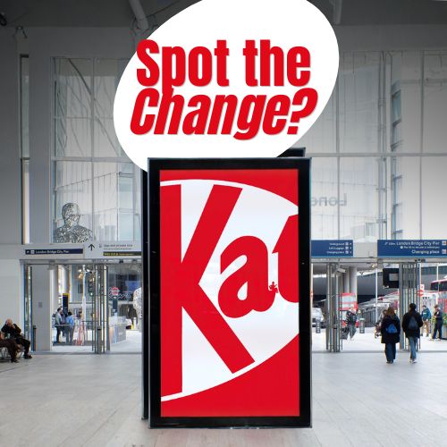
KitKat launched ‘Little Breaks,’ a minimalist OOH campaign by VML that reinterprets its iconic “take a break” message through hand-drawn illustrations. The campaign replaces words with visuals to express moments of pause in a simple and creative way.
A New Take on an Iconic Brand Idea
Few brands own a concept as strongly as KitKat owns the idea of “having a break.” For decades, the message has been consistent, recognizable, and deeply embedded in culture. With ‘Little Breaks,’ the brand takes a bold step by moving away from explicitly stating the tagline and instead letting visuals carry the meaning.
The campaign transforms the familiar KitKat logo into hand-drawn illustrations, each representing small, everyday moments of pause. This shift demonstrates confidence in the strength of the brand, proving that it no longer needs to say the message for people to understand it.
Minimalism as a Creative Strategy
The use of minimalist design is not just an aesthetic choice, but a strategic one. In a crowded outdoor advertising environment, simplicity becomes a powerful tool. The posters rely on clean compositions and subtle visual cues, allowing audiences to quickly grasp the message without cognitive overload.
By reducing elements to the essentials, KitKat creates space for interpretation. Each illustration invites the viewer to pause, mirroring the very behavior the brand promotes. The campaign becomes an experience rather than just a message.

Building on the Success of “Phone Break”
This campaign follows the success of the KitKat Phone Break campaign, which cleverly highlighted society’s dependency on smartphones by removing them entirely from visuals.
‘Little Breaks’ continues that narrative but evolves it. Instead of focusing on what people should disconnect from, it emphasizes what they can reconnect with: small moments of rest, enjoyment, and presence. The evolution feels natural, reinforcing KitKat’s long-standing brand platform while keeping it culturally relevant.
Turning the Logo into a Storytelling Device
One of the most interesting aspects of the campaign is how the logo itself becomes the medium. Rather than treating it as a static asset, the brand uses it as a canvas for storytelling.
Each variation reflects a different way to unwind, turning a simple graphic into a dynamic expression of behavior. This approach not only refreshes the brand visually but also reinforces its core idea in a subtle, intelligent way.

Why This Campaign Works
The strength of ‘Little Breaks’ lies in its restraint. It trusts the audience to make the connection without over-explaining. This is particularly effective in OOH, where attention spans are short and clarity is key.
The campaign also aligns perfectly with modern consumer behavior. In a world of constant notifications and distractions, the idea of taking a break resonates more than ever. KitKat positions itself not just as a snack, but as a moment of relief within a busy day.
Summary
KitKat evolves its long-standing brand platform by removing its famous tagline and letting design communicate the message. The campaign uses minimalist, hand-drawn illustrations integrated into the logo to represent everyday breaks. Building on the success of the KitKat Phone Break campaign, it shifts focus from digital disconnection to small moments of rest. The simplicity of the visuals makes it highly effective in OOH environments. Overall, the campaign reinforces KitKat’s identity while keeping it culturally relevant.
FAQs
What is the idea behind ‘Little Breaks’?
To show different ways people take small breaks using minimalist illustrations instead of text.
Why did KitKat remove its tagline?
Because the brand is strong enough for audiences to recognize the message without explicitly stating it.
Who created the campaign?
The campaign was developed by VML.
Craft emotive OOH that resonates
Explore high-visibility print and OOH formats that elevate brand values and recall.


Comments
Be the first to comment.